File:Exposure chart-XKCD.svg.png

Original file (1,726 × 2,048 pixels, file size: 1.33 MB, MIME type: image/png)
Summary
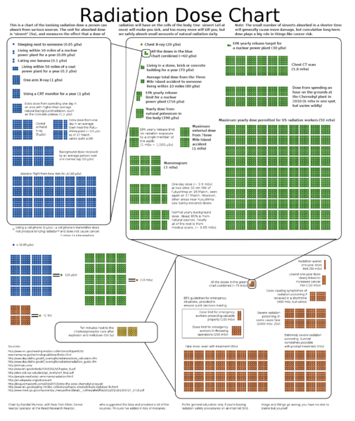
Radiation Dose Chart by Randall Munroe as part of the webcomic xkcd.
n response to concerns about the radioactivity released by the Fukushima Daiichi nuclear disaster in 2011, and to remedy what he described as "confusing" reporting on radiation levels in the media, Munroe created a chart of comparative radiation exposure levels. The chart was rapidly adopted by print and online journalists in several countries, including being linked to by online writers for The Guardian and The New York Times. As a result of requests for permission to reprint the chart and to translate it into Japanese, Munroe placed it in the public domain, but requested that his non-expert status should be clearly stated in any reprinting
File history
Click on a date/time to view the file as it appeared at that time.
| Date/Time | Thumbnail | Dimensions | User | Comment | |
|---|---|---|---|---|---|
| current | 19:18, 23 October 2022 | | 1,726 × 2,048 (1.33 MB) | Lwcamp (talk | contribs) | Radiation Dose Chart by Randall Munroe as part of the webcomic xkcd. n response to concerns about the radioactivity released by the Fukushima Daiichi nuclear disaster in 2011, and to remedy what he described as "confusing" reporting on radiation levels in the media, Munroe created a chart of comparative radiation exposure levels. The chart was rapidly adopted by print and online journalists in several countries, including being linked to by online writers for The Guardian and The New York Ti... |
You cannot overwrite this file.
File usage
The following page uses this file: